
mailer box printing
Showing the single result
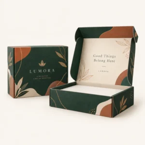
Mailer box printing puts your logo, colours and message directly onto a postal box, so the parcel itself carries your brand from warehouse to doorstep. It suits ecommerce sellers, subscription brands and gift businesses that want the delivery to feel considered rather than anonymous. The best results come from matching the print method, board colour and finish to the product inside and to the journey the parcel will take.
Mailer box printing explained
A mailer box is a folding corrugated box that closes with a tuck flap and usually travels without an outer shipping carton. Printing on that box therefore has two jobs. It must look sharp when the customer opens it, and it must stay legible after handling, stacking and sorting. Good mailer box printing plans for both jobs from the start, rather than treating the box as a blank canvas and hoping the design survives the journey.
Most printed mailers use full colour printing, which builds images from cyan, magenta, yellow and black inks. Spot colours can be added when an exact brand colour matters more than a photographic image. The choice depends on the artwork. A detailed illustration or photograph usually suits full colour printing. A simple logo in one or two flat colours may suit spot colour work, provided the board and finish support it.
Printing on the outside of the box
The outside is the first surface a customer sees, and it is also the surface that takes the most wear. Keep the main message clear at a glance. A logo, a short line of text and a simple pattern often read better than a dense design that competes with the delivery label. Leave a clean area for the address label and any carrier markings, so essential delivery information stays easy to scan.
Colour and finish choices for the outer surface
Board colour changes how ink appears. White board gives bright, crisp colours and suits detailed artwork. Kraft board gives a natural, warm tone and suits simple, bold designs, although pale colours can look softer on kraft than on white. A matte finish gives a calm, modern feel and reduces glare in photographs. A gloss finish gives stronger contrast and can make colours appear richer, but it also shows scuffs more readily.
Printing on the inside of the box
Inside printing creates the moment of opening. A message, a pattern, a thank you note or a simple illustration on the lid can turn a routine delivery into a memorable one. Because the inside faces less handling than the outside, finer detail and lighter colours often work well there. Inside print is especially useful for subscription boxes and gifts, where the reveal is part of the product experience.
When inside print earns its place
Inside print earns its place when it adds information or feeling that the outside cannot carry. Care instructions, a short brand story, a QR code to a help page or a seasonal message all work well inside the lid. Avoid repeating the outside design at full size inside the box, as that can feel wasteful and can distract from the product. A restrained inside design usually photographs better and feels more premium.
How to prepare artwork for mailer box printing
Artwork preparation matters more than many buyers expect, because a mailer box is printed flat and then folded into shape. Text that sits too close to a fold can distort, and a design that looks balanced on screen can feel crowded once the flaps and panels are in place. Ask for the exact template for the box size and style you have chosen, and build the artwork to that template from the start.
Supply artwork at a high resolution and in the colour format requested by the printer. Check that logos are sharp rather than stretched, and that small text remains readable at the actual printed size. If the design includes a border or a pattern that runs to the edge, allow for the trim and fold areas shown on the template, so the finished box does not show an unwanted white edge.
Artwork files and proofing
A proof is your chance to catch errors before production. Read every word on the proof, check the spelling of web addresses and contact details, and confirm that the logo colours match your brand. View the proof at the size it will print, not only zoomed in on screen, because small text and fine lines behave differently at real size.
Checking colour on kraft and white board
Colour on screen is backlit, while colour on board is reflected, so a proof will never match a monitor exactly. Kraft board will warm most colours and soften pale tones. White board will hold brighter colours more faithfully. If exact colour matters, ask about a printed sample or a colour reference on the same board you plan to use, and judge it in natural daylight rather than under harsh office lighting.
Choosing print coverage, finishes and quantities
Print coverage means how much of the box surface carries ink. Full coverage gives a bold, immersive look, but it uses more ink and can show wear on edges and folds. Partial coverage keeps the natural board visible and can suit a minimal brand. Neither option is better in every case. The right coverage is the one that supports your brand, survives handling and remains affordable at your order quantity.
Finishes add texture and protection. Lamination can protect the printed surface from moisture and scuffing. Foil can highlight a logo or a short line of text. Embossing can raise a design from the surface, while debossing presses it into the board. Use one or two finishes with intent, rather than combining several, because restraint usually reads as more premium than a busy surface.
Ordering in a way that protects consistency
Consistency matters when customers receive repeat orders. Keep a master copy of the approved artwork, note the board, print method and finish used, and refer to that record when reordering. Small changes in board shade or finish can shift the look of a design, so a clear record helps future runs match the first one as closely as possible.
Lead times after artwork approval
Standard lead times after final artwork approval are 10 to 14 working days. Corrugated boxes follow a lead time of 12 to 15 working days, and rigid or specialist boxes follow a lead time of 13 to 16 working days. These are production lead times, not a guaranteed delivery date, and they start only once the artwork has been finally approved. Plan seasonal launches around that timetable, and allow time for proofing before the production clock starts.
To discuss print options for your own design, request a quote through the get a quote page, browse the full range on the shop page, or explore related packaging in the mailer boxes collection and the mailer box sleeves collection.
Frequently asked questions
Can I print on both the inside and outside of a mailer box?
Yes, inside and outside printing can be combined, and many brands print a bold design outside and a simpler message or pattern inside. Check the proof for both surfaces before approval, because the inside and outside are printed from different parts of the same template.
Will my logo look the same on kraft board as on white board?
No, not exactly. White board holds bright colours more faithfully, while kraft board warms colours and softens pale tones. If exact colour is critical, view a sample on the board you plan to use before approving a large run.
What artwork format should I supply?
Supply high resolution artwork built to the template for your chosen box size and style, with text checked at real printed size. The quote team can confirm the preferred file format and colour settings for your design.
How long does production take after artwork approval?
Standard production takes 10 to 14 working days after final artwork approval. Corrugated production takes 12 to 15 working days, and rigid or specialist production takes 13 to 16 working days. Proofing time sits before that period, so allow for it in your launch plan.