
ecommerce packaging design
Showing the single result
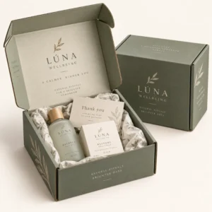
Ecommerce packaging design is the process of planning how a printed box looks, reads and opens, from logo placement and colour to structural folds and inside print. Good design protects the product, communicates the brand in seconds and turns a routine delivery into a memorable opening moment without making packing harder.
ecommerce packaging design that works on the doorstep
A box is first seen in imperfect conditions, often in low light, at an angle or in a photograph taken by the customer. That means the most important design element is clarity. A logo that is legible at a glance, a colour that is recognisable without a label, and a short message will usually outperform a dense design full of small text. Start by deciding what one idea the outside should communicate, then remove anything that competes with that idea.
Colour choice needs care on board. Kraft board warms colours and softens contrast, while white board keeps colours brighter and cleaner. Test your brand colours on the actual board you plan to use, not only on screen, because screen colour and printed board colour can differ noticeably. If exact colour matching matters, discuss colour references with your supplier early and check a printed proof before approving a full run.
Layout, hierarchy and print areas
Every box has natural print areas and natural problem areas. Flat panels suit logos and main messages, while folds, seams and tape zones can distort print or hide it completely. Work from a dieline, which is the flat template showing folds, cuts and glue areas, and place key elements well away from folds. Keep address label space clear, since a label placed over a logo or over busy pattern will frustrate both the courier and the customer.
Hierarchy means deciding what the eye should find first, second and third. Usually the logo comes first, a short brand line second, and any practical information third. Use size and spacing to create that order, rather than relying on many colours or many type styles. Two typefaces at most, used consistently, will look more professional than a mix of styles competing for attention.
Typography that stays readable
Choose type that remains readable when printed on board and viewed from a short distance. Very thin letterforms can disappear on kraft board, while very small text can blur on corrugated surfaces. Test the smallest text size on a printed sample, especially for care instructions, website details or social handles. If a line of text is hard to read on a sample, it will be harder to read on a doorstep in poor light.
Inside print and the opening sequence
Inside print is where many brands add personality. A pattern, a welcome message, a simple illustration or a care note can reward the customer for opening the box. Keep inside print purposeful, so it supports the product rather than distracting from it. For example, a skincare brand might print a short routine inside the lid, while a gift brand might print a message that makes the box feel like part of the gift itself.
Plan the opening sequence in order. What does the customer see first when the lid lifts? Is the product visible, or is it hidden under tissue? Does an insert card sit on top, or does it get lost under loose fill? A simple sequence, such as lid message, tissue, product, then a thank you card underneath, feels intentional and is easy for packing staff to repeat. Test the sequence with someone who has not seen the design before, and watch where their hands pause or hesitate.
Finishes and their effect on design
Finishes such as matte lamination, gloss, foil and embossing change how a design feels. Matte finishes read calm and premium, gloss finishes make colour appear vivid, foil draws the eye to a single focal point, and embossing adds a tactile detail that photographs well. Use finishes sparingly, because a box with every finish applied at once can look busy and can increase production complexity. Choose one feature to highlight, and let the rest of the design support it quietly.
Artwork, proofing and practical checks
Good artwork preparation prevents most print problems. Supply artwork at the correct size and resolution, embed or outline type as advised by your supplier, and check that images are not stretched or pixelated. Keep important text away from cut edges and folds, and confirm colour values before proofing. A short artwork checklist, shared with your designer, will save time and reduce back and forth during proofing.
Proofing is the stage where design meets reality. Check spelling, logo alignment, colour, fold positions and the placement of any barcode or label area. Print a sample if possible, then pack it, tape it, stack it and open it as a customer would. A design that survives handling will represent your brand far better than a design that only looks good as a flat file on screen.
For related ideas, see the ecommerce packaging ideas range and the ecommerce packaging inserts range. To explore formats, visit the full packaging shop range. When artwork and dimensions are ready, use the request a packaging quote page.
Lead times after artwork approval
After final artwork approval, standard lead times are 10 to 14 working days, corrugated lead times are 12 to 15 working days, and rigid or specialist lead times are 13 to 16 working days. These are guide times for production, not a guaranteed delivery date. Allow extra time for proof revisions, since rushing a proof is a common cause of avoidable print errors. For delivery detail, see the delivery information page and for supplier background, see the about Personalized Mailer Boxes page.
Frequently asked questions
What should go on the outside of an ecommerce box?
Keep the outside simple: a legible logo, a recognisable colour and a short brand message. Leave a flat, clear area for the address label away from folds and busy print.
Is inside print worth the extra effort?
Inside print can be very effective when it has a clear purpose, such as a welcome message, a pattern or care guidance. It rewards the customer at the moment of opening and can make a standard box feel considered.
How do I choose between kraft and white board?
Kraft board gives a natural, warm look and softens colour, while white board gives brighter, cleaner print. Test your brand colours on both boards before committing to a full run.
What is a dieline and why does it matter?
A dieline is the flat template showing folds, cuts and glue areas for a box. Designing to the dieline prevents logos and text from falling on folds or seams where they can distort.
How long does production take after artwork approval?
After final artwork approval, standard production is 10 to 14 working days, corrugated production is 12 to 15 working days, and rigid or specialist production is 13 to 16 working days. These are guide times, not a guaranteed delivery date.