
mailer box packaging design
Showing the single result
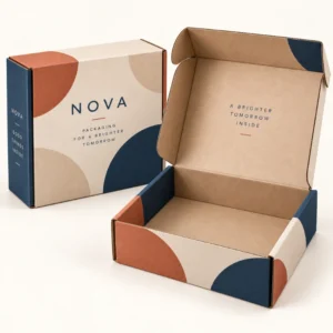
Mailer box packaging design is the planning of artwork, layout, colour and finish across every panel of a mailer box, so the box communicates a brand clearly from the doorstep through to the moment of opening. Good mailer box packaging design balances a strong first impression with a clear, uncluttered reveal, and it works with the box structure rather than fighting it. The best designs are usually simple at first glance, with one clear message on the outside and a thoughtful detail inside that rewards the customer for opening the box.
Mailer box packaging design principles that work
Start with hierarchy: what should the customer notice first, second and third. For most brands, the logo or brand name comes first, followed by a short line that explains what is inside or why it matters, followed by smaller details such as a website address or care note. If every element competes for attention, none of them stands out. Use scale, spacing and colour contrast to guide the eye, and leave empty space around the main message so it can breathe. A design that looks good on a flat screen may still fail on a box if the main message sits across a fold or is split by a tuck flap, so always check layout against the real panel shapes.
Designing the outside for the doorstep moment
The outside is seen in varied light, at a distance and often in a photograph, so it needs to be legible and recognisable quickly. Bold typography, a limited colour palette and a clear logo usually work better than dense illustration or small text. Consider how the box will look next to other parcels, on a doorstep and in a delivery photograph, and test the design at a small size. If the brand cannot be recognised at thumbnail size, simplify the outside and move detailed storytelling inside, where the customer has time and attention to enjoy it.
Colour and typography choices
Choose colours that remain true on your chosen board. White board keeps colours bright and clean, while kraft board warms colours and softens pale tones, so test colour swatches on the actual board if possible. Limit the palette to a few core colours plus one accent, and use typography that stays legible at the smallest size you plan to print. Avoid very thin lettering on a busy background, and keep essential information, such as a website address, large enough to read without effort. Consistency with your website, labels and inserts will make the box feel like part of a coherent brand, not a one off experiment.
Designing the inside for the unboxing reveal
The inside is where many brands create their most memorable moment. A customer who has just opened a parcel is attentive, curious and ready to engage, so inside print can carry a thank you message, a brand story in a few lines, care instructions or a simple pattern that makes the product feel considered. Tissue, an insert card and a neatly placed product can extend that reveal, but they should complement the inside print rather than hide it. Think about the sequence: the customer lifts the lid, sees the message, then sees the product. Design that sequence deliberately, rather than filling the inside with unrelated graphics.
Patterns, illustration and photography on boxes
Patterns work well when they repeat cleanly across panels and do not fight with the logo or message. Test how a pattern flows around corners and across the lid, because a join in the wrong place can break the effect. Illustration can add personality, especially for gifts, food and lifestyle brands, but it needs room to breathe and should not crowd the product space. Photography on a mailer box can look striking, but it demands high resolution images and careful colour control, and it can date quickly if it shows a specific product range. Whichever approach you choose, keep one dominant visual idea per box.
Finishes as part of the design
Finishes are design tools, not decorations added at the end. Matte lamination gives a soft, premium feel and reduces glare in photographs, gloss adds vibrancy and contrast, foil draws the eye to a logo or headline, and spot gloss can highlight a pattern without changing the whole box. Choose one finish to lead and use others sparingly, if at all. Also consider how a finish affects recycling and the feel of the box in the hand, because customers notice tactility even if they cannot name it. You can see printed examples in the shop for printed boxes and learn about the maker on the about us page.
From mailer box packaging design to approved artwork
A strong design process moves from concept to mockup to proof in clear stages. First, agree the message and hierarchy. Next, test the layout in a mockup, in closed and open views, to check folds, corners and the unboxing sequence. Then prepare artwork on the correct dieline, with text clear of folds and cut edges, and check a proof for spelling, colour and panel positions. Allow time for revisions, because a rushed approval often leads to a printed error that is expensive to fix. Lead times after final artwork approval are standard 10 to 14 working days, corrugated 12 to 15 working days and rigid or specialist 13 to 16 working days. Planning details are on the delivery information page. When the design is ready, you can request a quote for mailer boxes with your artwork and specification.
Frequently asked questions
What makes good mailer box packaging design?
Good design has a clear hierarchy, a legible outside, a thoughtful inside reveal and artwork that respects folds and panel shapes. Simplicity, contrast and consistency with the wider brand usually matter more than decoration.
Should I print inside the box?
Inside print is highly effective for unboxing because the customer sees it at a moment of high attention. A short message, pattern or care note inside can make a simple outside design feel premium.
How many colours should I use?
A limited palette usually works best. Choose a few core colours plus one accent, test them on your chosen board, and keep contrast strong for text and logos.
Does kraft board change my design colours?
Yes, kraft can warm colours and soften pale tones. Test colours on kraft before approval, and adjust contrast or colour choices if pale elements become hard to read.
Can I use photography on a mailer box?
Yes, provided images are high resolution and colour is controlled. Photography suits bold, simple compositions, but avoid crowded images that compete with the logo and message.