
mailer box design
Showing the single result
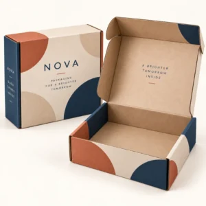
Mailer box design is the process of planning how a postal box looks, feels and opens, so that it protects the product inside while communicating a brand clearly. It covers artwork and layout, colour and type, print and finish, and the practical structure of the box itself. Good mailer box design does not rely on decoration alone; it makes the delivery easy to recognise, easy to open and easy to remember.
Principles of strong mailer box design
The strongest designs start with a single clear idea. That idea might be a bold colour, a simple illustration, a short message or a distinctive pattern, but it should be recognisable at a glance and consistent across orders. When a design tries to say everything at once, the customer often remembers nothing. A restrained palette, generous empty space and one focal point usually create a more premium impression than a surface crowded with competing elements.
Hierarchy matters on every surface. On the outside, the brand name or logo should be the easiest element to find, followed by any message that helps the customer understand what has arrived. On the inside lid, a thank you note, a pattern or a short brand story can reward the act of opening. Supporting information, such as care instructions or social details, belongs where the customer will look for it after opening, not where it competes with the first impression.
Designing for the outside and the inside
Many brands focus only on the outside, yet the inside lid is often the surface customers photograph and remember. An outside design can be bold and simple, while the inside can be warmer and more detailed, with a message, illustration or pattern that appears only when the box is opened. This contrast creates a small moment of surprise, which is valuable for gifts, subscriptions and products bought as a treat. If budget allows only one printed surface, choose the one your customers will see most: the outside for brand recognition in transit, or the inside for the unboxing moment.
Colour, type and imagery that work in print
Colour choice should suit both the brand and the board. Bright colours print vividly on white board, while light colours and metallic foil stand out on kraft or black board. Type should remain legible at the size it will actually print, so test small text on a proof rather than trusting a screen view. Imagery should be high resolution and simple enough to survive printing on corrugated board, where very fine detail can soften. A design that looks good on screen but loses detail in print will disappoint, so proofing is part of design, not an afterthought.
How mailer box design affects protection and packing
Design is not only visual. The structure of the box, the size relative to the product, and the choice of inserts all affect how well the product travels. A box that is too large wastes material, allows the product to move, and can increase postal size. A box that is too tight can crush tissue, bend inserts or make packing slow. Good design therefore starts with the packed product: its dimensions, weight, fragility and any items that travel with it, such as cards, samples or tissue.
Packing speed also matters. A design that requires fiddly folding, precise alignment of an insert, or careful placement of several loose items will slow a packing bench and increase errors. The best designs make the correct pack obvious: the product sits in a clear position, the insert guides placement, and the lid closes without force. When design and packing work together, the customer receives a box that looks considered, and the seller packs orders efficiently.
Design for different products and audiences
Apparel brands often use a simple, bold outside with tissue and a card inside, because clothing is light and flexible. Skincare and candle brands often need inserts to hold jars or bottles upright, and a design that keeps the focus on the product rather than the box. Gift and subscription brands often invest more in the inside lid and in small extras, because the experience of opening is part of the value. Thinking about who will open the box, and why, helps you decide where to spend design effort.
Common design mistakes to avoid
One common mistake is placing essential text too close to folds, flaps or edges, where it can be cut off or creased. Another is using low resolution images that look sharp on screen but blur in print. A third is choosing colours that look different on kraft, white and black board, because board colour changes how ink appears. Checking a physical proof, keeping text within safe areas, and testing the design on the actual board all prevent these problems before production.
From mailer box design idea to finished box
A practical design process moves from brief to artwork to proof to production. Start with a brief that covers the product, the audience, the brand colours and type, and any messages that must appear. Create artwork at the correct size for the box, keeping the dieline and safe areas in mind, and allow backgrounds to extend to the bleed edge where required. Review a proof at actual size, check spelling, logo placement and colour, and approve only when you are satisfied. After final artwork approval, standard lead times are 10 to 14 working days, and corrugated lead times are 12 to 15 working days. Treat those windows as production guides rather than guaranteed delivery dates.
Keep your artwork files organised for reorders, including the final approved version and any notes about board, finish and print colours. Consistency across reorders builds recognition, and a clear file record makes seasonal artwork changes much easier. If you update a design, change one element at a time where possible, so customers still recognise the box while noticing something fresh.
Browse the shop for packaging options to compare mailer styles, and look at custom mailer boxes for branded orders and printed mailer boxes for print ideas. For a tailored specification, use the get a quote form for custom packaging and include product size, quantity and design ideas.
Frequently asked questions
What makes a good mailer box design?
A good mailer box design has a clear focal point, legible type, colours that suit the board, and a structure that fits the product. It also considers the opening sequence, so the outside, inside lid and product presentation work together.
Should I print inside my mailer box?
Inside print is worth considering if the unboxing moment matters to your brand. A message or pattern on the inside lid rewards opening and is often photographed by customers, while outside print builds recognition in transit.
How do I avoid text being cut off on a mailer box?
Keep text and logos within safe areas, away from folds, flaps and edges, and check a proof at actual size. Allow backgrounds to extend to the bleed edge so no white border appears where colour should reach the edge.
Does board colour affect mailer box design?
Yes. White board gives bright, precise colour, kraft board gives a warm, natural tone, and black board makes light print and foil stand out. Test colours on the actual board before approving artwork.
What file should I supply for mailer box design?
Supply high resolution artwork at the correct box size, with text as editable or outlined as requested, and images at print quality. Check the proof carefully for spelling, placement and colour before approval.