
mailer box design ideas
Showing the single result
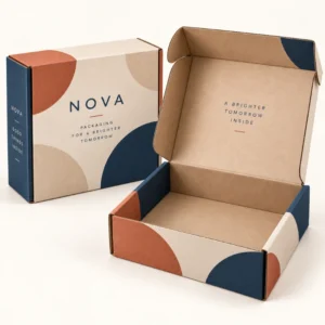
Mailer box design ideas are creative ways to make a postal box more memorable, more useful and more closely tied to a brand, without losing sight of protection and packing practicality. The best ideas work at the moment of opening, when the customer first sees the product and forms an impression of the business behind it. A mailer box design ideas list is most useful when it is filtered by product, audience and budget, because an idea that suits a luxury gift may not suit a high volume subscription.
Mailer box design ideas that start with the opening moment
The opening moment is the heart of mailer design. When the lid lifts, the customer should see something deliberate: a product arranged neatly, a colour that matches the brand, a short message, or a pattern that continues from the outside. Tissue in a brand colour, a printed inside lid, or a simple card on top of the product can all create that sense of care. The key is restraint. One or two well chosen details usually feel more premium than a box crowded with extras that distract from the product itself.
Consider the journey of the box before it is opened. The outside is seen by couriers, neighbours and anyone who handles the parcel, so it should be recognisable and tidy. The inside is seen only by the customer, so it can be more personal. Using the outside for bold branding and the inside for a warmer message gives each surface a clear job, and makes the transition from delivery to unboxing feel like a designed experience rather than a simple parcel opening.
Inside lid ideas customers remember
The inside lid is a large, flat surface that many brands leave blank, which is a missed opportunity. A short thank you message, a brand motto, an illustration, or a repeating pattern can transform it. Seasonal messages work well here, because the lid can change for Christmas, a product launch or an anniversary without changing the box structure. Keep the message short and legible, and test it on the actual board, because colours and fine type can behave differently on kraft, white or black surfaces.
Messages, patterns and illustrations that suit a lid
Short messages work best on a lid, because the customer reads them in a few seconds while lifting the product out. A pattern can be more subtle, using brand shapes, dots, lines or botanical motifs in a single colour. Illustrations should be simple and bold, with clear shapes that remain recognisable when printed on corrugated board. Avoid very fine lines and tiny text on a lid, since they can soften in print and become difficult to read.
Mailer box design ideas for different kinds of orders
Gift orders benefit from ideas that build anticipation. A closed box with a simple outside, a ribbon or belly band, tissue, and a handwritten style card can make the gift feel considered before the product is even seen. Subscription orders benefit from consistency with small variations: the same box each month, with a different inside lid message, card or tissue colour to mark each delivery. Online retail orders benefit from clarity, with the product protected, easy to remove, and accompanied by care information or a simple next step.
Ideas should also suit the product itself. Apparel can be folded neatly with tissue and a card, and does not usually need a complex insert. Fragile goods need an insert or cushioning first, and design second, because a beautiful box that allows damage will not create a good impression. Food and candle products often need clear labelling and careful placement, so design ideas should leave room for essential information and for safe removal of the product.
Colour, theme and seasonal ideas
Colour is one of the simplest ways to change the feel of a mailer. A single brand colour used boldly on the outside can be instantly recognisable, while a softer palette can feel calm and premium. Seasonal themes can refresh a familiar box without a full redesign: a winter pattern, a spring colour, or a limited edition illustration can mark a moment while keeping the structure and size unchanged. This approach also helps with storage and packing, because the team already knows how the box assembles.
Using inserts, cards and tissue as design elements
Inserts, cards and tissue are not only protective; they are part of the visual design. A fitted insert in a contrasting colour can frame the product, while a card with a short message can guide the customer to care instructions, a discount for a next order, or a social channel. Tissue in a brand colour adds softness and a sense of occasion. When these elements share a palette and type style with the box, the whole parcel feels coordinated, even if each element is simple on its own.
Turning mailer box design ideas into a finished order
Start by choosing one idea to test, rather than trying several at once. Mock up the box with a real product, photograph it as a customer would see it, and ask a colleague or customer for an honest reaction. Check that the idea does not slow packing, increase damage, or hide essential information. If the test works, keep notes on board, colours, insert size and card wording, so the idea can be repeated consistently. After final artwork approval, standard lead times are 10 to 14 working days, and corrugated lead times are 12 to 15 working days. Treat those windows as production guides rather than guaranteed delivery dates.
Ideas evolve best when they are revisited after real orders. Customer photographs, reviews and repeat purchase patterns can show which details customers notice and which they ignore. Keep the ideas that customers mention, simplify the ones they overlook, and retire details that add packing time without adding delight. Over time, this creates a mailer design that is distinctive, practical and genuinely connected to the brand.
Browse the shop for packaging options to compare mailer styles, and look at custom mailer boxes for branded orders and printed mailer boxes for print ideas. For a tailored specification, use the get a quote form for custom packaging and include product size, quantity and design ideas.
Designing mailer box design ideas for shipping
Mailer box design ideas should be judged by how they survive shipping, not only by how they look on a screen or on a shelf. A design that places print where a delivery label will cover it, or that uses a closure that pops open in sorting, will disappoint even if the artwork is beautiful. Test each idea in a real shipping journey, with the board, seal and label area you plan to use, and check the box on arrival for scuffing, crushing and ease of opening. That shipping test turns a retail focused design into a design that works for online orders as well.
Frequently asked questions
What are simple mailer box design ideas for small brands?
Simple ideas include a printed inside lid message, tissue in a brand colour, a short thank you card, and a single bold logo on the outside. These details are affordable, easy to pack, and make a clear difference to the opening experience.
How can I make a subscription box feel special each month?
Keep the box structure and branding consistent, and vary a small detail such as the inside lid message, tissue colour or card. This gives regular customers something new to notice without changing packing routines.
Do design extras slow down packing?
They can, if they require precise placement or several loose items. Test the full pack on a bench, time it, and simplify any step that causes delays or errors before ordering at scale.
Can I use seasonal artwork on a mailer box?
Yes. Seasonal artwork on the inside lid or as a card is a practical way to mark a season or launch while keeping the box size and structure unchanged. Plan artwork approval in good time for the season.
What mailer box design idea works best for gifts?
For gifts, a tidy outside, tissue, a card and a clear reveal on opening usually work best. Keep the product easy to remove and avoid extras that hide the gift or make opening awkward.