
luxury mailer box design
Showing the single result
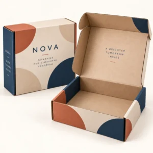
Luxury mailer box design is the process of planning how a printed mailer looks, feels, opens and protects a product, so the box works as both a shipper and a brand experience. Good design considers artwork, board, size, closure and finish together, rather than treating print as an afterthought. When those elements align, a customer receives a parcel that is easy to open, neat inside, and clearly from a brand that cares about detail.
What luxury mailer box design covers
Design starts before artwork. It starts with the product, the journey and the customer. A designer needs to know what will sit inside the box, how heavy it is, whether it is fragile, and whether the parcel will be opened as a gift. Those answers shape board choice, box size, insert shape and closure type. Only then does artwork make sense, because artwork must fit the panels, folds and opening sequence of the real box.
A mailer is usually a self locking corrugated box that folds from a flat sheet. Its main panels are the outer lid, the inner lid, the base and the side walls. Each panel has a job. The outer lid carries first impression branding. The inner lid carries the reveal. The base carries product support and, often, a short message or care note. Designing with those jobs in mind avoids artwork that is cut off by a fold or hidden by an insert.
Designing the outside first impression
The outside should be recognisable at a glance, even when the parcel is held by a courier or placed on a doorstep. A clear logo, a consistent brand colour and a simple pattern or image usually work better than a dense collage. Leave breathing space around the logo, so it does not compete with handling labels and tape. If the box will carry a shipping label, plan a clear area for it in the artwork, so the label does not cover a key design element.
Colour and typography choices
Colour should stay true to the brand, but also print well on corrugated board. Deep colours can look rich on a white or kraft surface, yet small light text on a dark panel needs care to stay readable. Typography should be large enough to read at arm’s length for the brand name, with smaller text reserved for details on the base or inside. Limit the design to two or three type styles at most, so the box feels coherent.
Designing the inside reveal
The inside is where luxury mailer box design earns its reputation. When the lid lifts, the customer should see a tidy layout, not a tangle of loose fill. A printed inner lid message, a patterned tissue layer, or a colour contrast between outside and inside can create a moment of delight. The product should sit centred in its insert, with any card or note placed where it will be noticed without blocking the product.
Using contrast between inside and outside
Contrast is a simple, effective tool. A calm kraft or muted outer can open to a bright or patterned inner. A dark outer can open to a pale inner that makes the product stand out. Contrast works best when it is intentional and tied to brand colours, rather than random. Test the contrast with a physical sample, because screen colours often look different on printed board.
Structure, size and finish in luxury mailer box design
Structure decides how a mailer behaves in real use. A roll end tuck front style, often used for mailers, gives a secure closure and a neat front edge. A crash lock base adds strength for heavier orders. A tear strip gives clean, easy opening and avoids damaged edges from cutting tape. A self sealing strip can speed packing, but check that it suits returns, because some customers need to reseal a parcel.
Size is a design decision, not just a measurement. A box that is too large wastes material, looks careless and allows products to move. A box that is too tight is hard to pack and can damage edges. Measure the product with all its contents, including tissue, cards and inserts, and allow a small, consistent margin. Standardising sizes across a range also simplifies artwork, because panels can share a layout system.
Finishes that add a premium feel
Matte lamination gives a soft, scuff resistant surface and suits minimal designs. Soft touch lamination feels velvety and suits high end skincare, jewellery and gift ranges. Foil stamping highlights a logo or border in metallic colour. Embossing adds raised texture, while spot UV adds gloss to a chosen area. Each finish changes how light plays on the box, so choose finishes that support the artwork rather than competing with it.
Choosing one hero finish
Pick one finish to lead the design, such as foil for a logo or soft touch for the whole surface, and let other finishes support it quietly. Using foil, embossing, spot UV and a busy pattern together can make a box look noisy. A restrained combination usually photographs better and feels more premium in the hand.
From design concept to finished luxury mailer box design
A practical design process has clear stages. First, agree the product, size and structure. Second, create artwork to the correct panel dimensions, with bleed and safe areas for folds. Third, check a proof for colour, text size and alignment across folds. Fourth, test a sample with the real product inside, including packing, sealing, opening and, if relevant, returning. Each stage catches a different kind of error, and skipping one often creates a problem that is costly to fix later.
Artwork files should be supplied at print quality, with fonts and images embedded or outlined as required by the printer. Keep a copy of the approved artwork and note the board, print and finish specification, so repeat orders match the first run. After final artwork approval, standard lead times are 10 to 14 working days, corrugated 12 to 15 working days, and rigid or specialist boxes 13 to 16 working days. These are typical lead times, not a guaranteed delivery date.
To turn a concept into a specified mailer, use the request a quote page. Useful related collections are the luxury mailer boxes collection, the luxury ecommerce packaging collection and the about us page.
Frequently asked questions
What should I design first, artwork or structure?
Structure first. Agree size, board and closure, then create artwork to fit the real panels. Artwork designed without structure often gets cut off by folds or hidden by inserts.
How much should I print inside a luxury mailer?
A printed inner lid message or pattern is often enough, plus a neat insert layout. Full inside print suits gift ranges, but a simple, well placed message can feel just as premium and is easier to proof.
Which finish is best for a luxury mailer?
Matte lamination suits most premium mailers, soft touch suits high end minimal designs, and foil suits a logo or accent. Choose one hero finish and test it on a physical sample in daylight.
How do I avoid artwork being covered by a shipping label?
Plan a clear label area in the artwork and keep key branding away from that zone. Check the label size you normally use and mark its position on the proof before approving artwork.
Why is a physical sample important?
A sample shows how board, print, finish, folds and inserts work together in the hand. It reveals colour shifts, text readability and packing issues that are hard to judge on screen alone.