
gable box design
Showing the single result
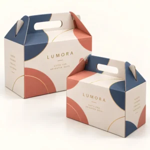
Gable box design is the planning of how a handled carton looks, reads and feels, from the logo position to the pattern on the angled top panels. Good design makes a small box do a lot of work: it identifies the brand at a glance, suits the occasion, and still leaves room for practical information. A thoughtful gable box design also respects the shape of the box, so artwork looks intentional when the box is folded, filled and carried.
Starting a gable box design with purpose
Before choosing colours or fonts, decide what the box must do. A bakery box must look appetising and be easy to recognise on a counter, a wedding favour box must feel personal and elegant, and a retail bundle box must communicate the product inside without a long explanation. That purpose guides every later choice, from a bold all over pattern to a quiet logo on kraft board. Look at the plain shape first, as shown in the gable box collection, and sketch where the eye should land first, second and last when a customer picks the box up.
Audience matters just as much as purpose. A children’s party favour can carry bright colours, playful shapes and a large name panel, while a corporate gift needs restraint, consistent brand colours and type that reads as professional. Seasonal designs add another layer: festive patterns, spring florals or autumn tones can make a familiar box feel timely, but the core logo and layout should stay recognisable so repeat customers still know the brand. Keep a simple design system, with set colours, fonts and logo rules, so future boxes feel like part of the same family even when the occasion changes.
Layout for flat and angled panels
A gable box has large flat side panels, narrower end panels and angled top panels that form the handle. The flat side panels are the best place for the logo, the product name and the main message, because they face the customer directly. End panels suit short details such as a website address, a thank you note or a small motif. Angled panels suit pattern, a repeated motif or a short celebratory phrase, because text there sits at a slope and can be harder to read from a distance. Test the layout on a folded sample, not only on a flat artwork file, so you can see how panels meet at the corners.
Hierarchy: what the eye reads first
Hierarchy means deciding the order in which information is read. Give the logo or product name the largest size and the clearest position, give a supporting message a smaller but still legible size, and give practical details the smallest size that remains readable in normal light. Avoid giving every element equal weight, because equal weight reads as clutter. White space, or plain board space, is part of the design too: it lets the main message breathe and makes the box feel more considered.
Colour, type and imagery in gable box design
Colour sets the mood before a single word is read. Natural kraft with dark ink feels rustic and honest, white board with bright colour feels fresh and modern, and deep tones with foil feel luxurious. Limit the palette to two or three main colours plus a neutral, so the box looks coherent rather than busy. Type should be chosen for legibility first: a clear sans serif or a simple serif for the product name, with decorative script reserved for a short accent word, because script can become hard to read at small sizes or on textured board.
Photography, illustration and pattern
Photography suits food boxes where the product itself sells the item, but a photograph must be high resolution and well lit, or it will look soft in print. Illustration suits gifts and favours, where a hand drawn motif or a simple icon can feel personal and distinctive. Repeating patterns work well on gable boxes, because they wrap around panels without needing a single focal image, and they hide minor scuffs better than a large flat colour area. Whichever route you choose, keep the style consistent with your other packaging, labels and online presence, so customers recognise the brand across channels.
Finishes and details that elevate a gable box design
Finishes are the tactile layer of gable box design. Matte lamination softens colour and feels premium, gloss lamination brightens colour and resists handling marks, and a spot gloss area can make a logo shine against a matte background. Foil adds celebration and luxury, embossing adds texture that invites touch, and a die cut window lets customers see the product, which can be more persuasive than any image. Choose finishes that support the design idea, not finishes that fight it: a rustic kraft design rarely needs gloss and foil together, while a luxury gift design may benefit from one restrained metallic accent.
Designing for the real world: handling, light and scale
A design that looks perfect on a large screen can disappoint at real size. Print a sample at actual size, view it in shop light and daylight, hold it at arm’s length, and check it from above and from the side. Small type, thin lines and low contrast colour pairs often fail these tests, especially on kraft board, where ink can look softer than on white board. If the box will sit among many others on a shelf, a stronger logo contrast and a simpler pattern will stand out better than fine detail that disappears at a distance.
Checking a design proof step by step
Work through a proof panel by panel. First check names, dates and spelling, then check logo placement and colour, then check that no essential text sits on a fold line or in the handle area. Then check the back and end panels, which are easy to overlook, and finally check any allergen, storage or care information for accuracy. Approve a proof only after this full pass, because correcting a printed box is far harder than correcting a digital file.
From gable box design to finished order
Once the design is settled, the production brief should record the layout, colours, fonts, board, finish and any window or special detail, so a reprint matches the original. Standard boxes are usually produced in 10 to 14 working days after final artwork approval, while corrugated boxes take 12 to 15 working days after final artwork approval. These timings cover production after approval, not a guaranteed delivery date, so keep proof time in your schedule. If you need a bespoke size or print to match your design, explore a custom gable box option or request a quote with your design brief attached to your enquiry.
Designing gable box design for shipping
A gable box design that will also travel by shipping needs to be designed for transit as well as for display on a counter. Choose board that keeps its shape when boxes are stacked, keep the handle strong enough for a filled box, protect any printed panel from scuffing, and leave a clear flat area for a delivery label if the box will travel inside an outer shipping carton. A design that looks good in a shop and survives shipping gives the same box a retail use and a shipping use without needing a second pack.
Frequently asked questions
Where should the logo go on a gable box design?
Place the logo on a large flat side panel, where it faces the customer directly and reads clearly at arm’s length. Use angled top panels for pattern or a short motif, rather than for essential text.
What colours work best for a gable box design?
Two or three main colours plus a neutral usually work best, because a limited palette looks coherent and prints reliably. Test colours on the actual board you will use, since kraft and white board show the same ink differently.
Should I use a window in my gable box design?
A window suits bakery treats, candles and other visually appealing products, because customers can see the item without opening the box. It is less useful for surprise gifts, where the reveal matters more than a preview.
How do I know if my gable box design will print well?
Supply high resolution artwork, keep text away from fold lines, and check a printed proof at actual size in normal light. That proof check catches small type, low contrast and layout problems before a full run.